For nearly fifteen years, the Los Angeles Review of Books (LARB) has been dedicated to rigorous, incisive, and engaging writing on every aspect of literature, culture, and the arts. I began working with LARB as a strategy and UX consultant at the beginning of a complete overhaul of their website.
Website Redesign
LARB had accumulated a vast archive of daily publication—2–3 pieces every day. In addition, LARB had previously relied on the piecemeal availability of volunteer developers, so much of the site was a patchwork system that was difficult to navigate, resulting in a drop in site traffic and readership.
I worked closely with the new in-house web developer and the executive director, conducting stakeholder interviews to understand desires for the new site and auditing analytics to identify pain points in user journeys.
We established key goals for the new site: make it easier to find existing content, simplify donation and membership asks, and better showcase current writing and upcoming programming.
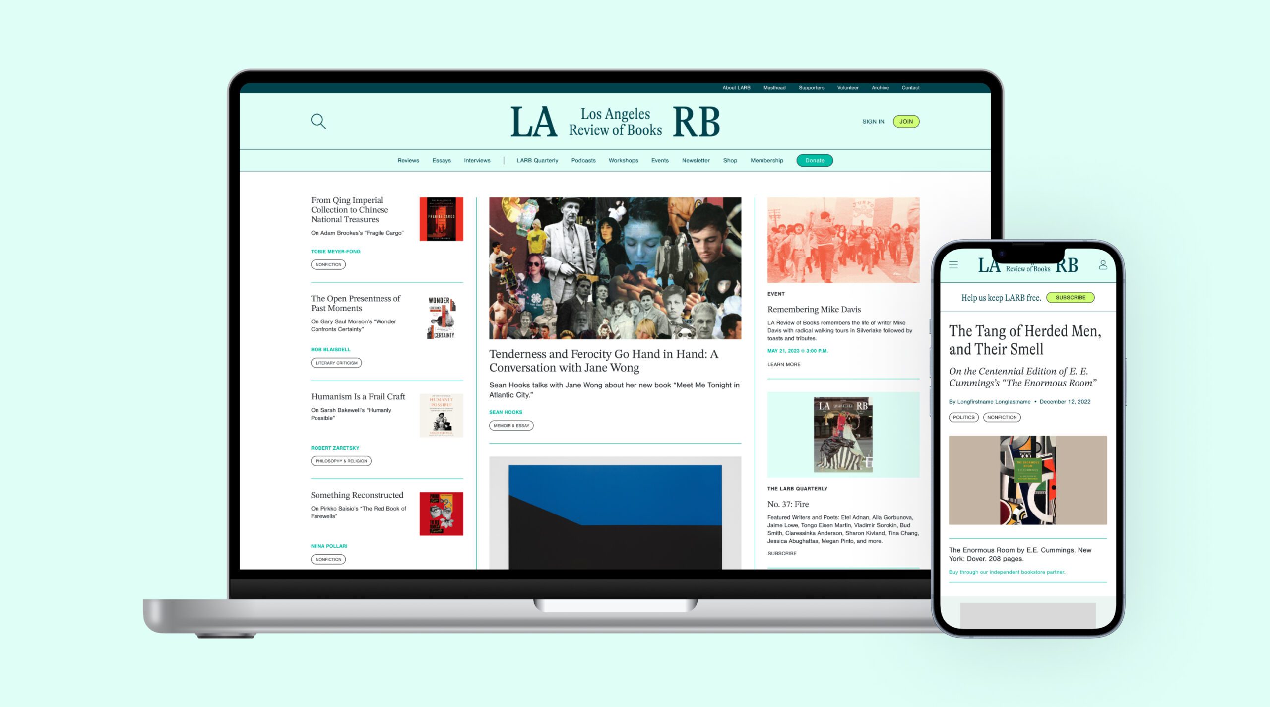
We began with the present taxonomy issues. In addition to helping refine and consolidate the category and tagging system, I also distilled all of their editorial content into three ‘buckets’: Reviews, Essays, and Interviews. These sections appear first in the main navigation of the site, ensuring editorial content continues as the primary focus but other key pages and the essential Donate CTA are visible and accessible.
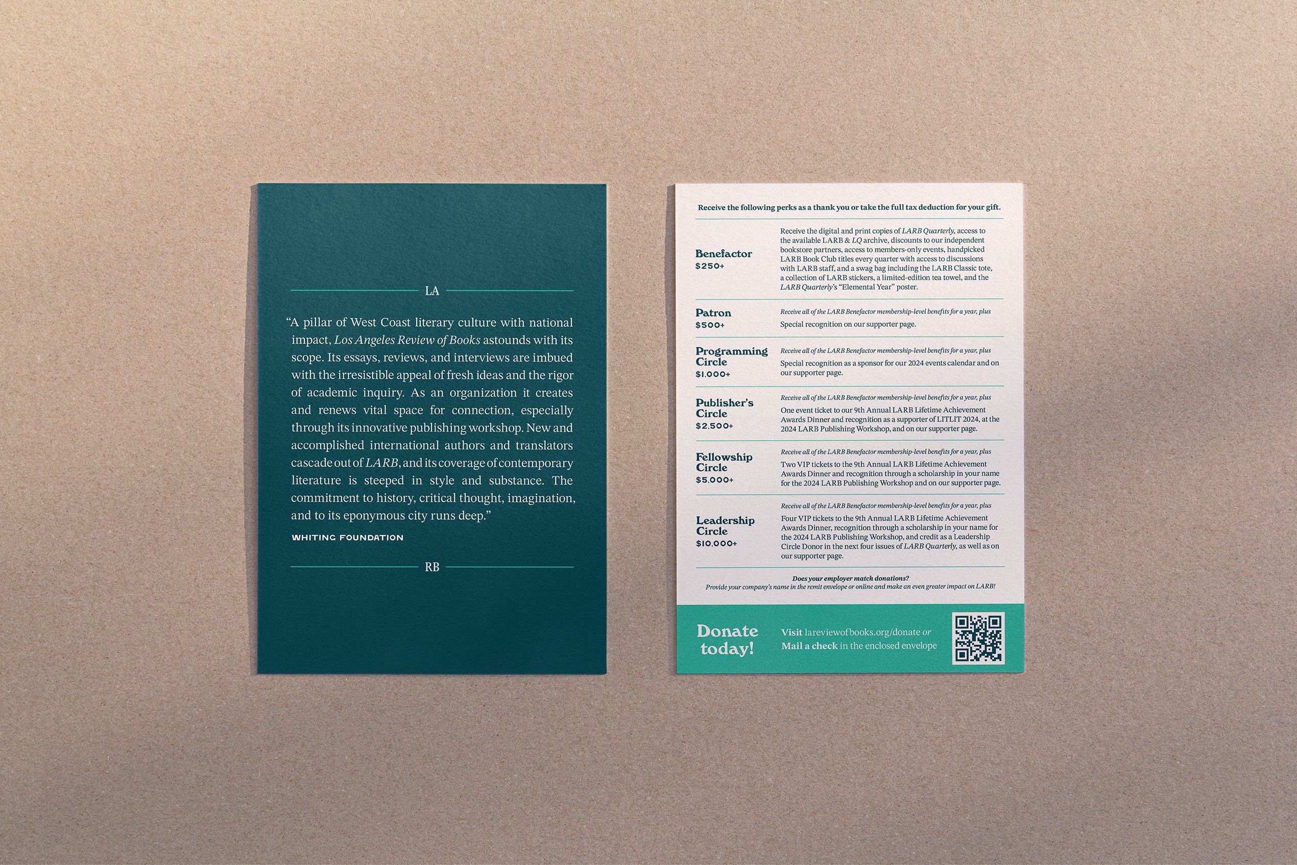
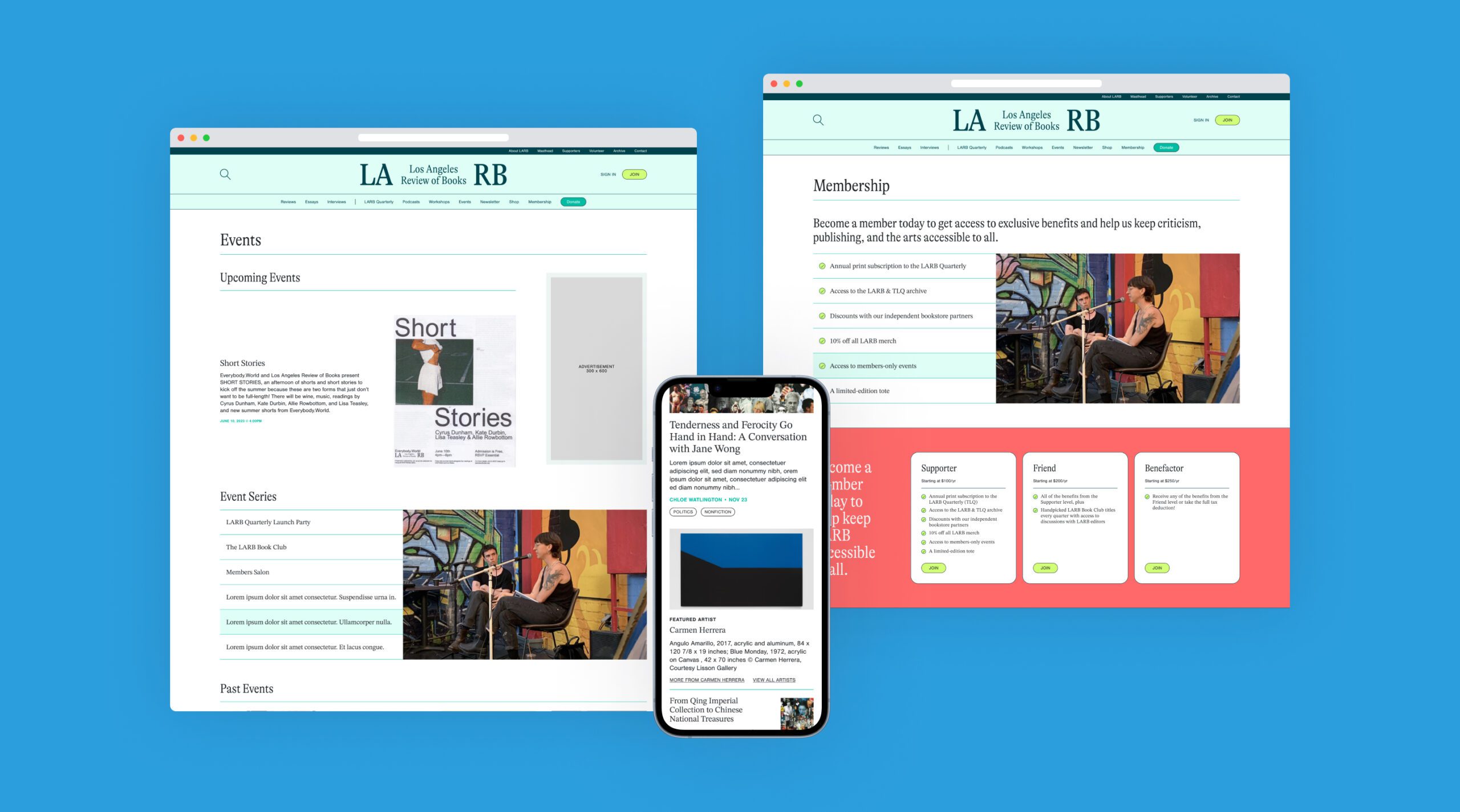
As both a publication and a non-profit, LARB offers tax-deductible donations, subscriptions to their quarterly magazine, and memberships, which include a subscription, partial tax-deductibility, and more. The language around these was often blended or repeated, confusing users. I helped refine the options to Donor, Subscriber, and Member, each of which has a respective CTA—Donate, Subscribe, and Join—as well as new card designs and descriptions for consistency across the site.
The strategy and UX work culminated in a complete website redesign—the new site was coinciding with the launch of a new visual brand. I created wireframes that reflected the updated look and feel for all top-level pages and templates for editorial content, including a new homepage that doubled the amount of content above the fold and added spaces for events, podcasts, and the quarterly magazine.
Smaller Projects
Following the success of the website redesign, I continued my relationship with LARB through various smaller projects.
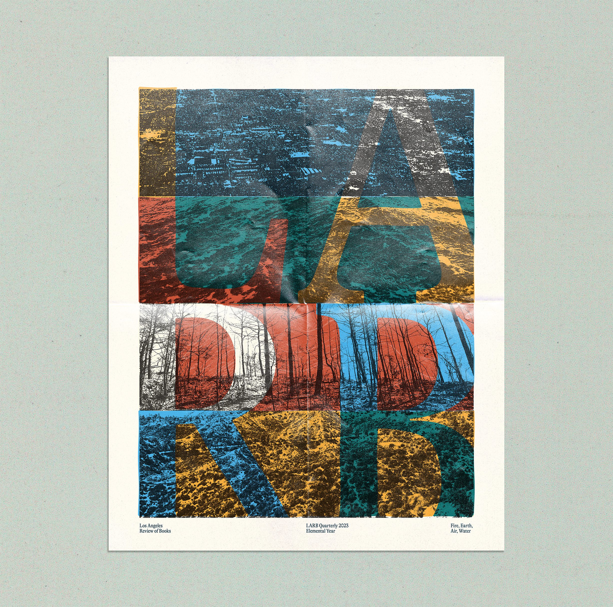
The editorial focus of the LARB Quarterly magazine in 2023 was the elements. The four issues were “Fire,” “Earth,” “Air,” and “Water,” each prompting the writers of the issue to interpret the element in their lives. To celebrate the “Elemental Year,” I created a poster that was to be included with the final issue as a gift for annual subscribers, inspired by pieces from each issue.
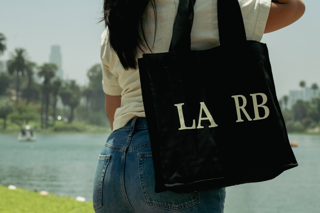
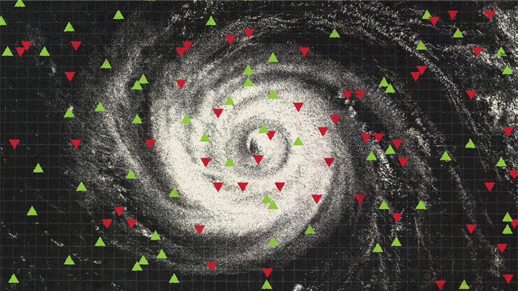
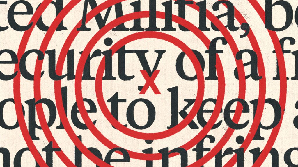
Other smaller work included a bumper sticker that is included as a membership bonus and a giveaway at many of the events LARB hosts, as well as several editorial illustrations for pieces on event prediction markets, how bad grammar is affecting our interpretation of the second amendment, and the implications of a contracting film industry in LA.

Annual Fund Drive
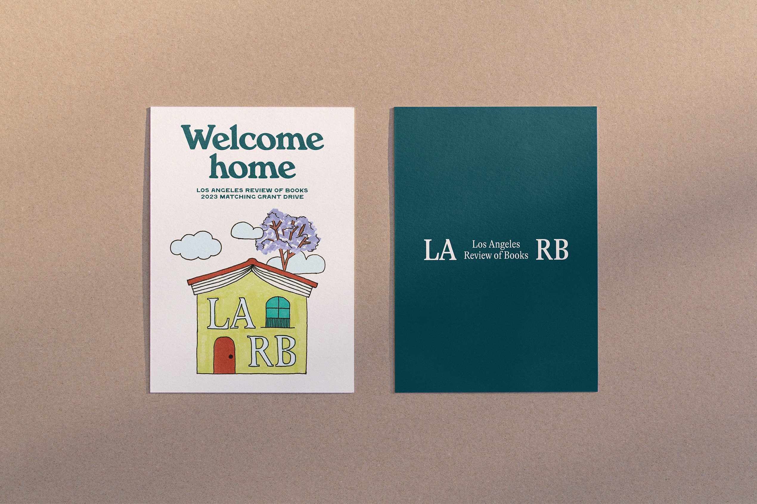
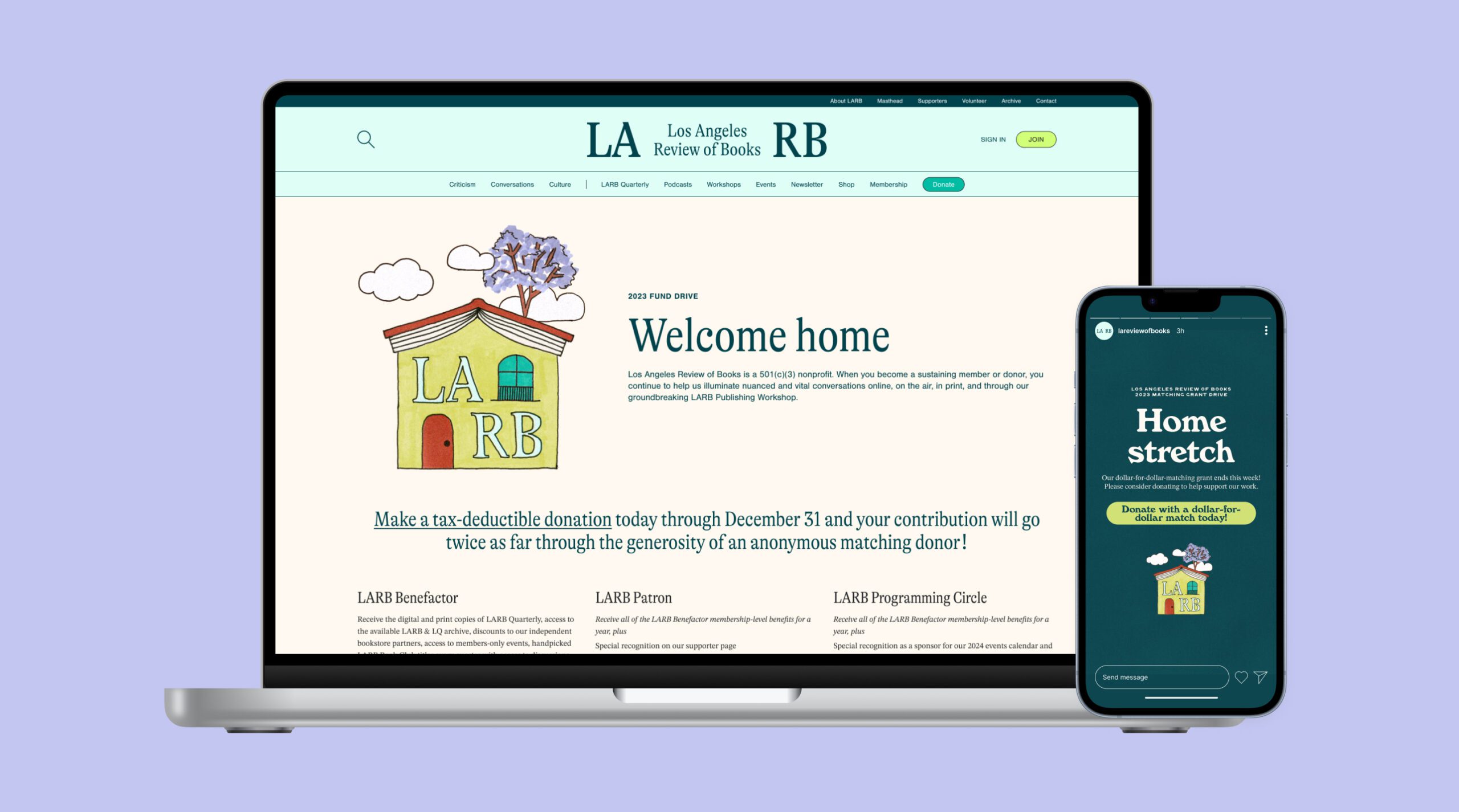
Most recently, I collaborated with the LARB team for its 2023 year-end fundraising drive—an essential push for a reader-supported magazine. Having recently moved into new offices in the Granada Buildings in Westlake, the theme of the drive was “Welcome home,” inviting people to contribute to the hub of all things literary in Los Angeles.
Following a project brief to highlight the distinct architecture of the new office with a playful and inviting tone, I created an illustration to anchor all touchpoints of the campaign, integrating existing brand colors to keep it familiar while introducing some new elements to ensure communications stood out and felt special. Those touchpoints included mailed printed collateral, a month’s worth of social content, and a dedicated webpage.