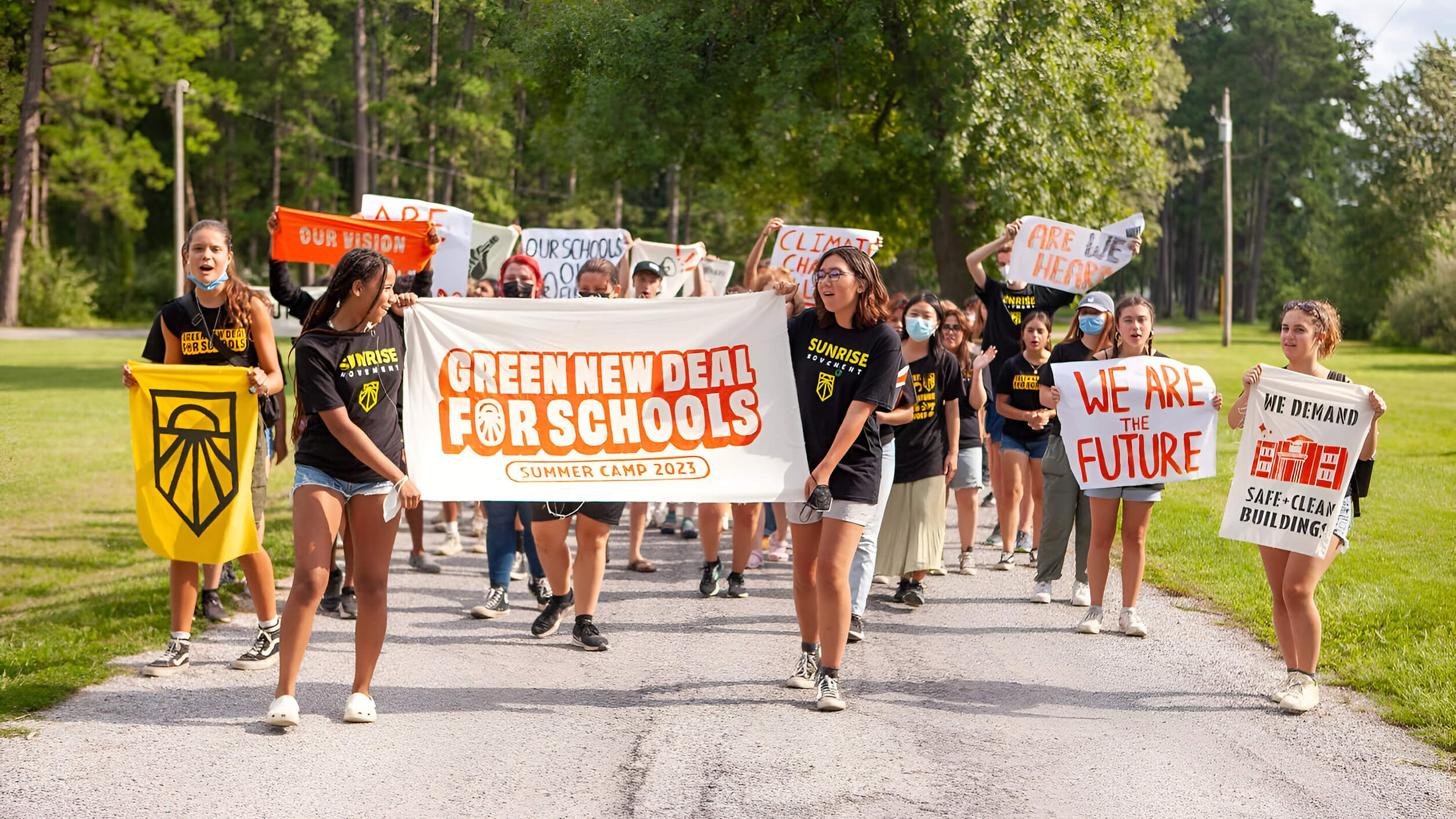
Since 2017, Sunrise Movement has organized young people against climate change through rallies, lobbying, and community building. Continuing on the success of its youth-led movement, the organization is now expanding, mobilizing communities across the country to invite more people into the climate justice fight for the Green New Deal (GND). A shift in brand strategy was necessary to highlight local organizing and invite new organizers into Sunrise’s work.
Brand Strategy
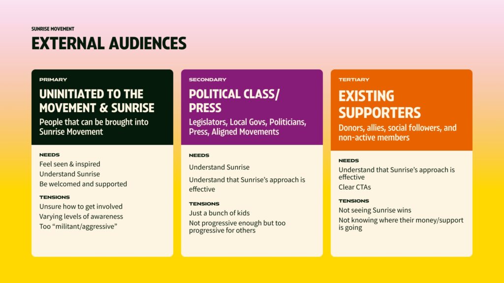
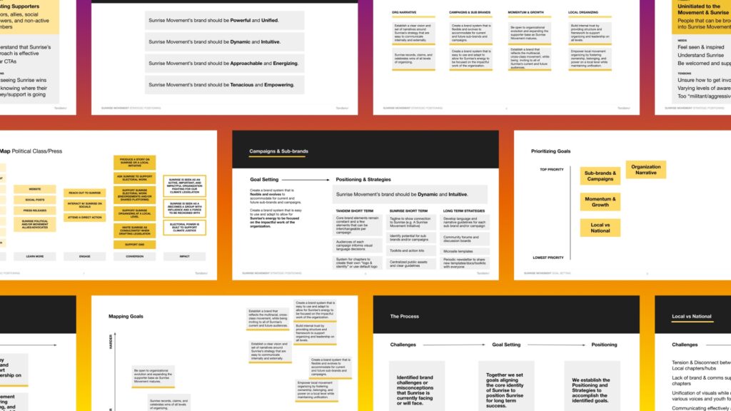
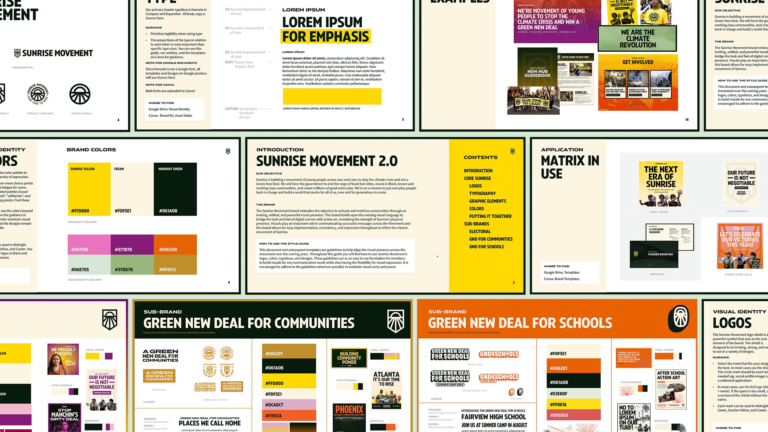
As new voices and perspectives join, it is essential to demonstrate the power, unity, tenacity, and energy at the core of everything Sunrise does. The process began with identifying and prioritizing audiences and brand goals during sessions with key stakeholders. These findings translated to a matrix on which the brand system is built, allowing Sunrise to use distinct voices and tones and tailor visuals across audiences.
Visual Identity
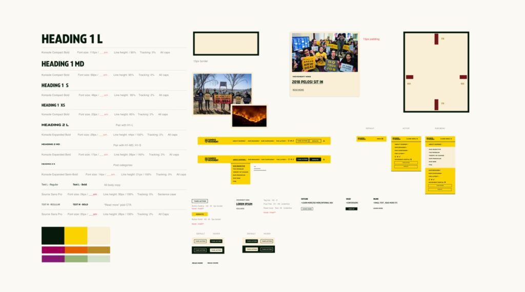
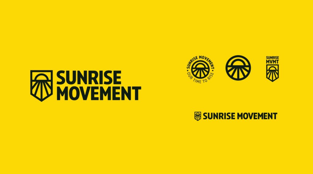
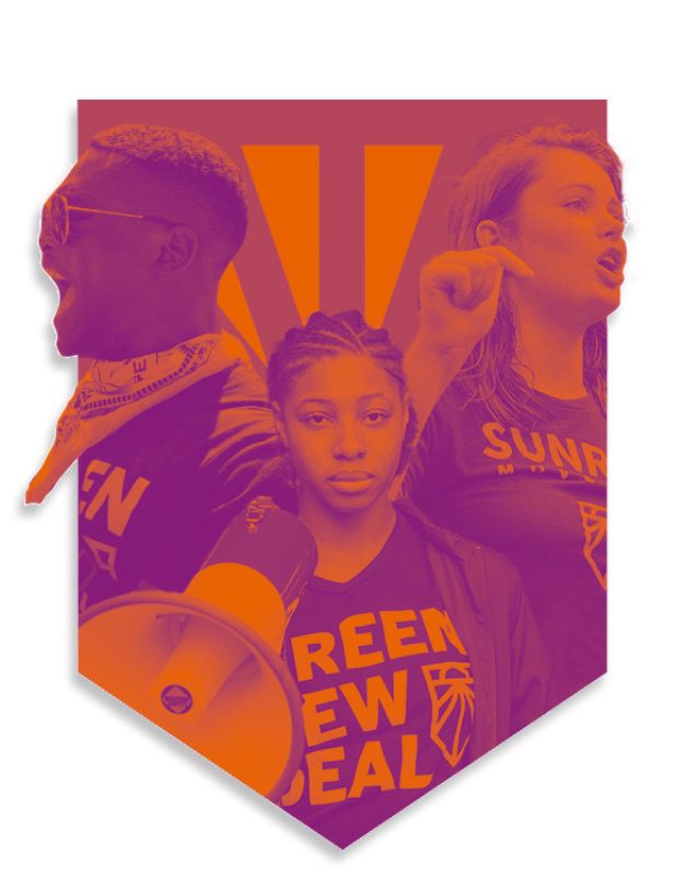
We maintained the Sunrise shield as a key component of the brand to demonstrate the battle that the movement will continue to face; however, modifications allowed for the shape to be maintained while making it friendlier, more legible, and easier to use across different mediums.
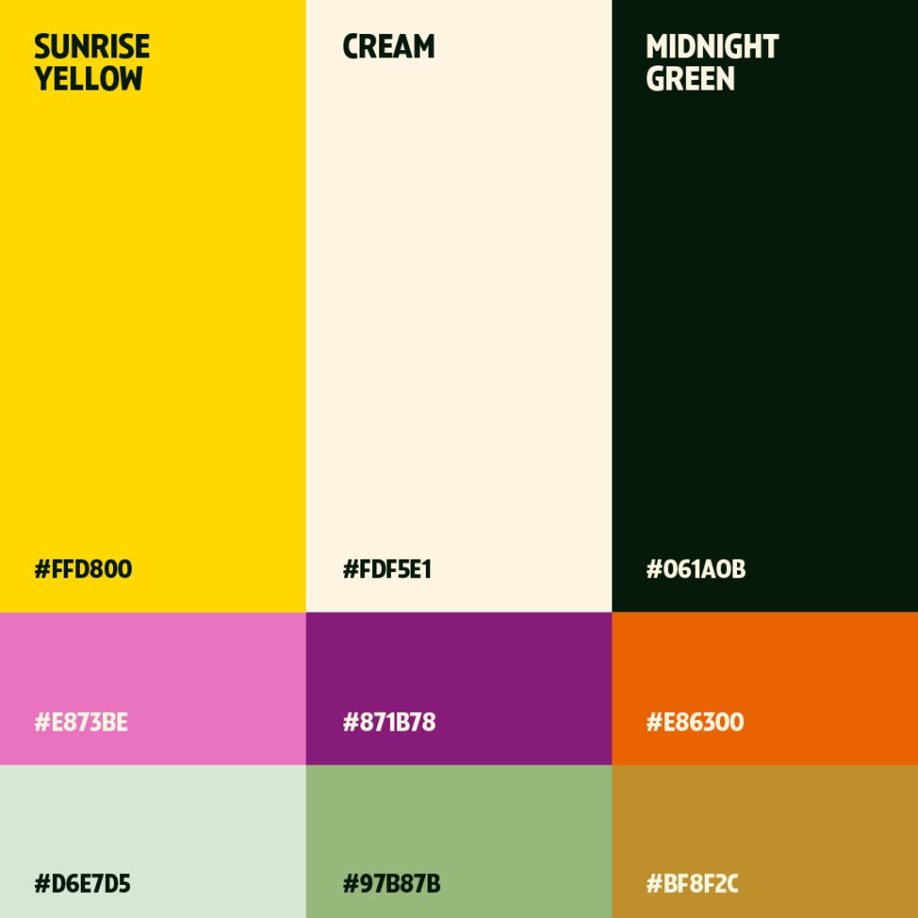
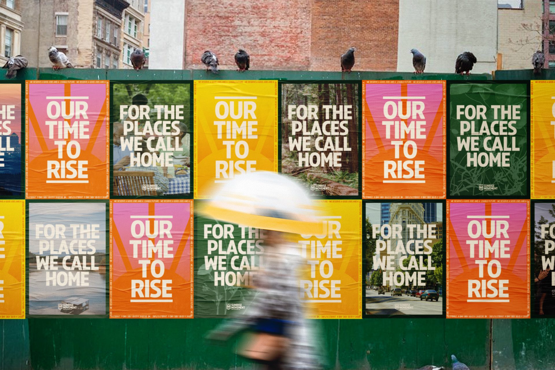
We also expanded the color palette to include a dark green that signals seriousness while also adding some warmth and humanity to the brand with pink, purple, and orange as secondary colors. The evolution of the palette was important to create a look and feel that is youthful, energizing, and dynamic. To that end, we paired select palette colors to create gradients that help Sunrise feel contemporary among its peers.
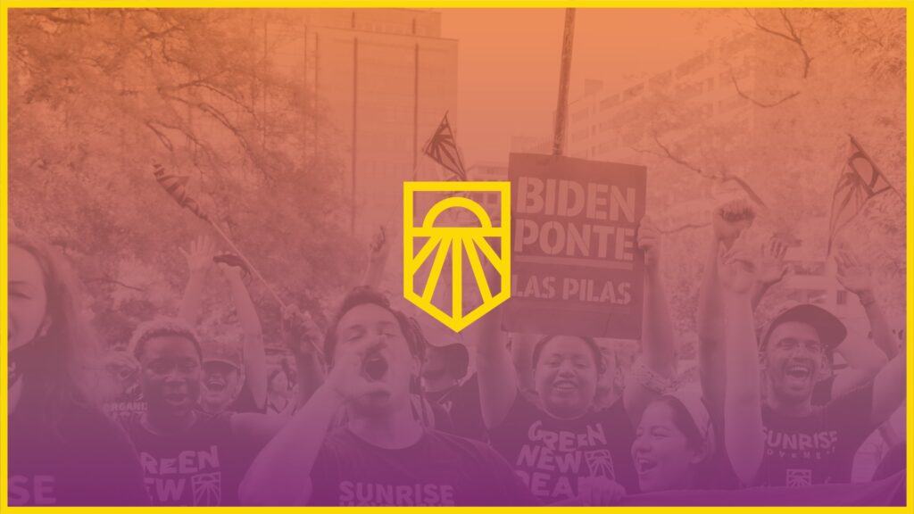
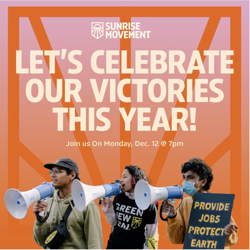
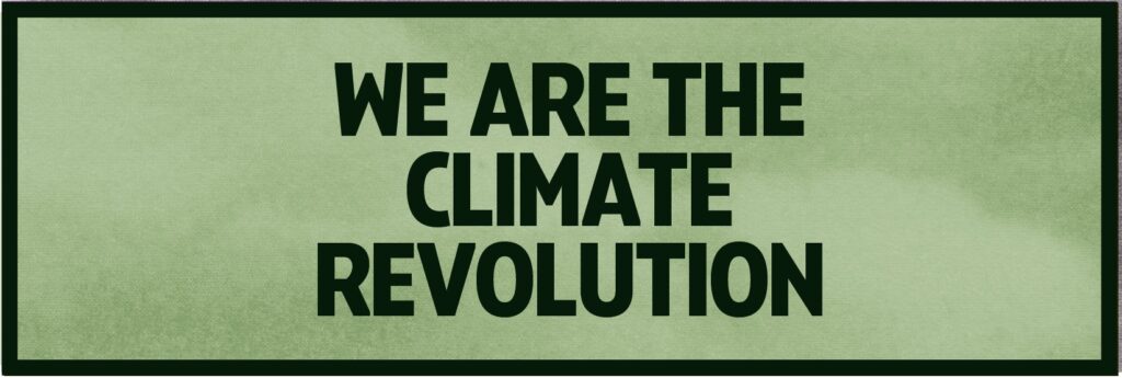
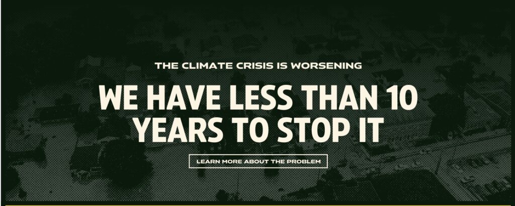
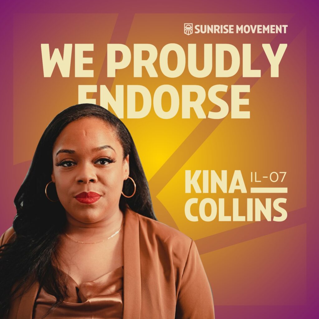
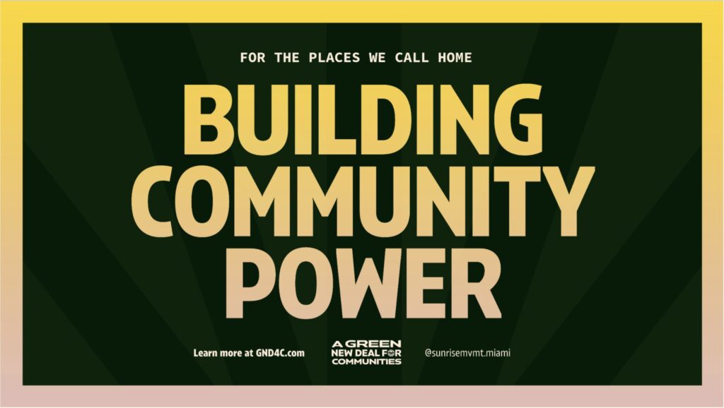
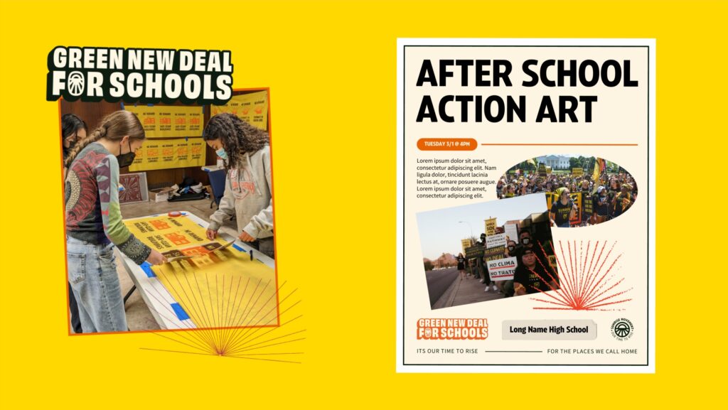
Sunrise has use for a variety of expressions and it is important to have a range of image choices and treatments to reflect the expansive organization. Sunrisers and their supporters are generally shown in full color and vibrant color treatments, emphasising the hope, community, and joy that empowers them to change the perception of what organizing and movement building means. Conversely, adversaries of the movement and negative events are generally shown in darker colors and halftone images.
The Sunrise brand is built to be flexible yet consistent, allowing for creative expression, art activism, and dynamic communication strategies amongst the various Sunrise members. Leveraging existing workflows, we built a collaborative and easily deployable system in Canva to house the brand and sub-brands, and created extensive templates allowing for various levels of expression and skill sets.
Brand guidance included key points to help with decisions regarding image choice, sub brands, different communication channels, and voice and tone. Sunrise staff and members have continued to create, iterate, and explore the bounds of the brand system.

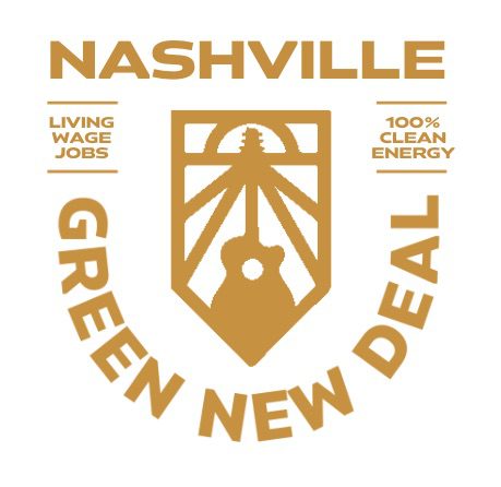
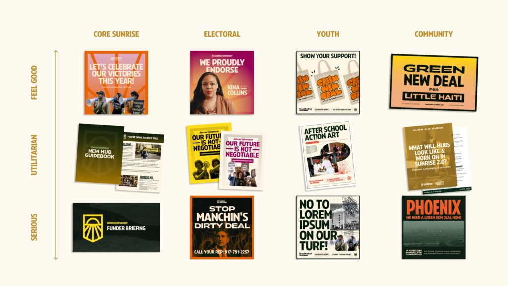
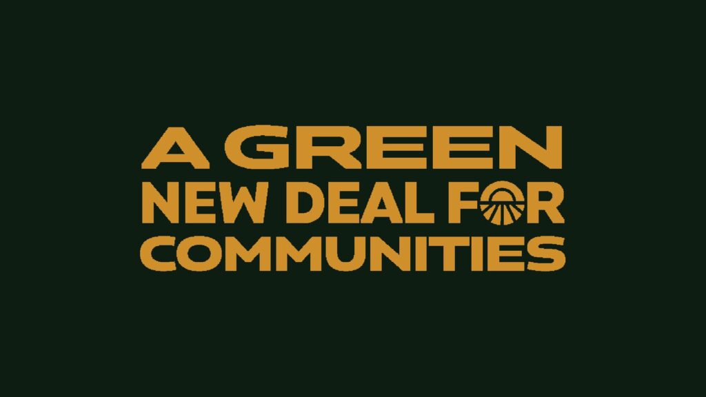
Sub-brands
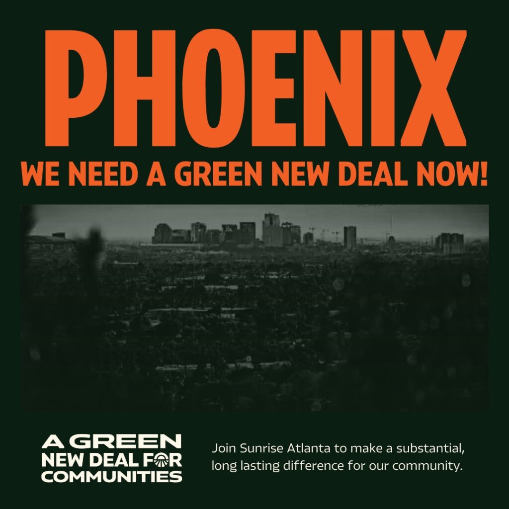
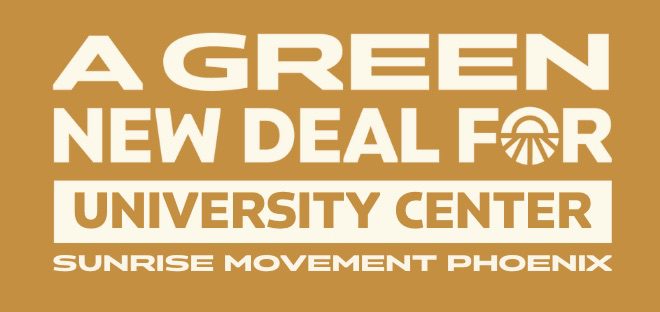
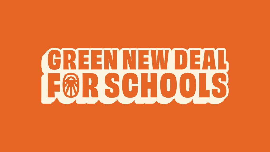
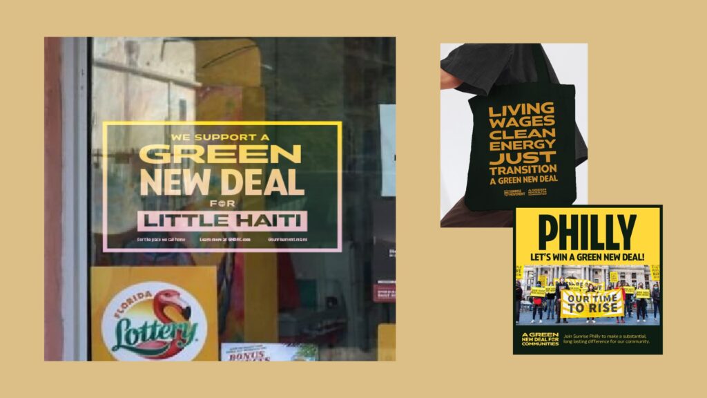
We also developed sub-brand identities for two of the major parts of the new brand strategy, the Green New Deal for Schools and Communities, expanding the core palette, creating new color ratios, and establishing new lockups and templates for the hundreds of Sunrise chapters across the country.
Building on those two sub-brands, we established general sub-brand guidelines that account for existing campaigns and allow for creativity and expression in new campaigns.
Website
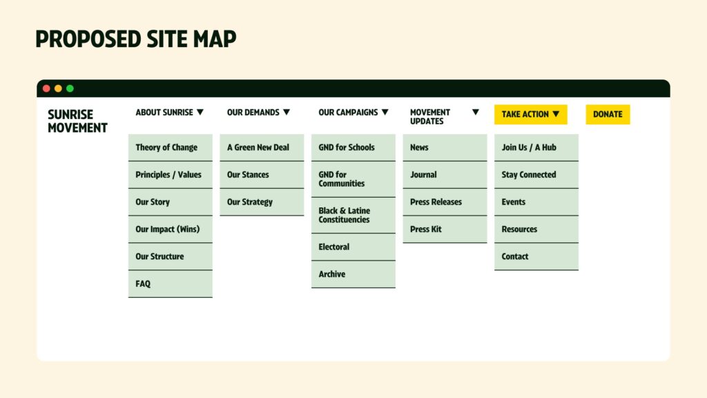
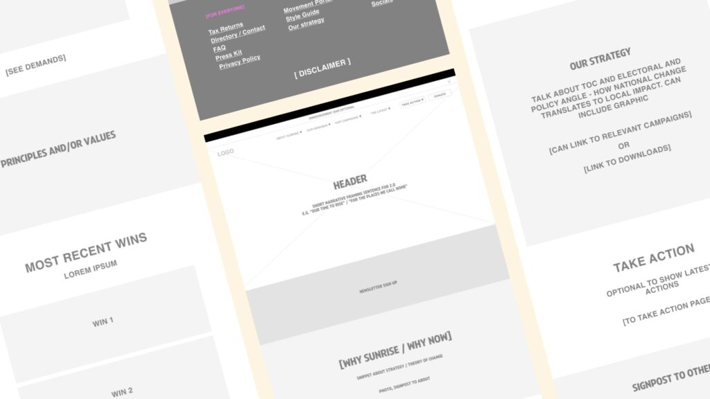
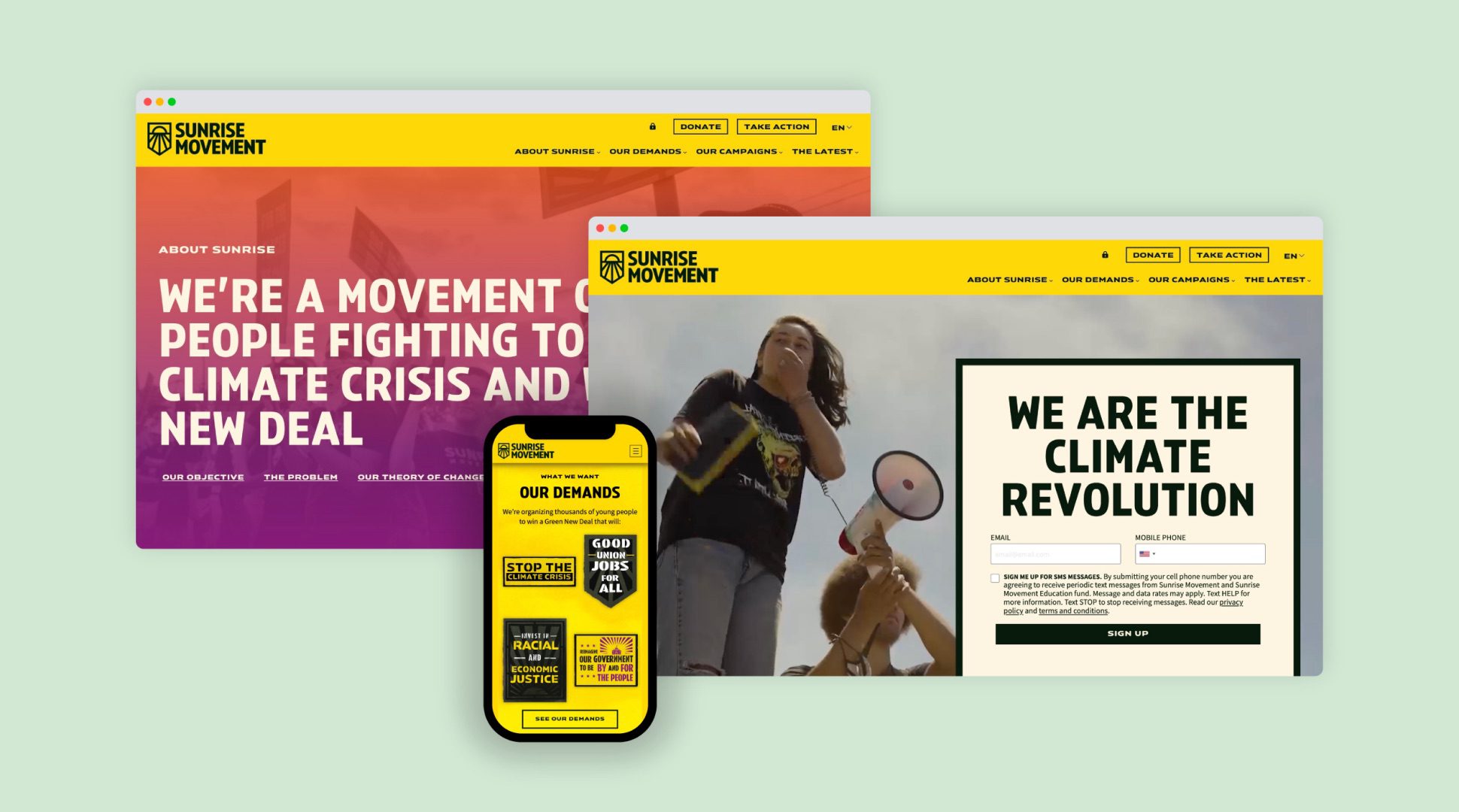
A youth led movement such as Sunrise needs a strong digital presence and digital home to provide resources, tools, and engage their members. The new website reflects their new look and feel, combining urgency with vision and hope. It was built as a home for members: a place to showcase and celebrate their victories, attract new members, and be a centralized resource for their work across the country. The website funnels new members into different levels of engagement—a variety of actions and campaigns are predominately featured to attract all interest levels, building a strong and diverse coalition.
We coordinated extensively with a separately selected web development contractor to provide detailed wireframes and a user interface kit to establish consistent type and element styles.