Episcopal Diocese of Indianapolis

Branding, web development

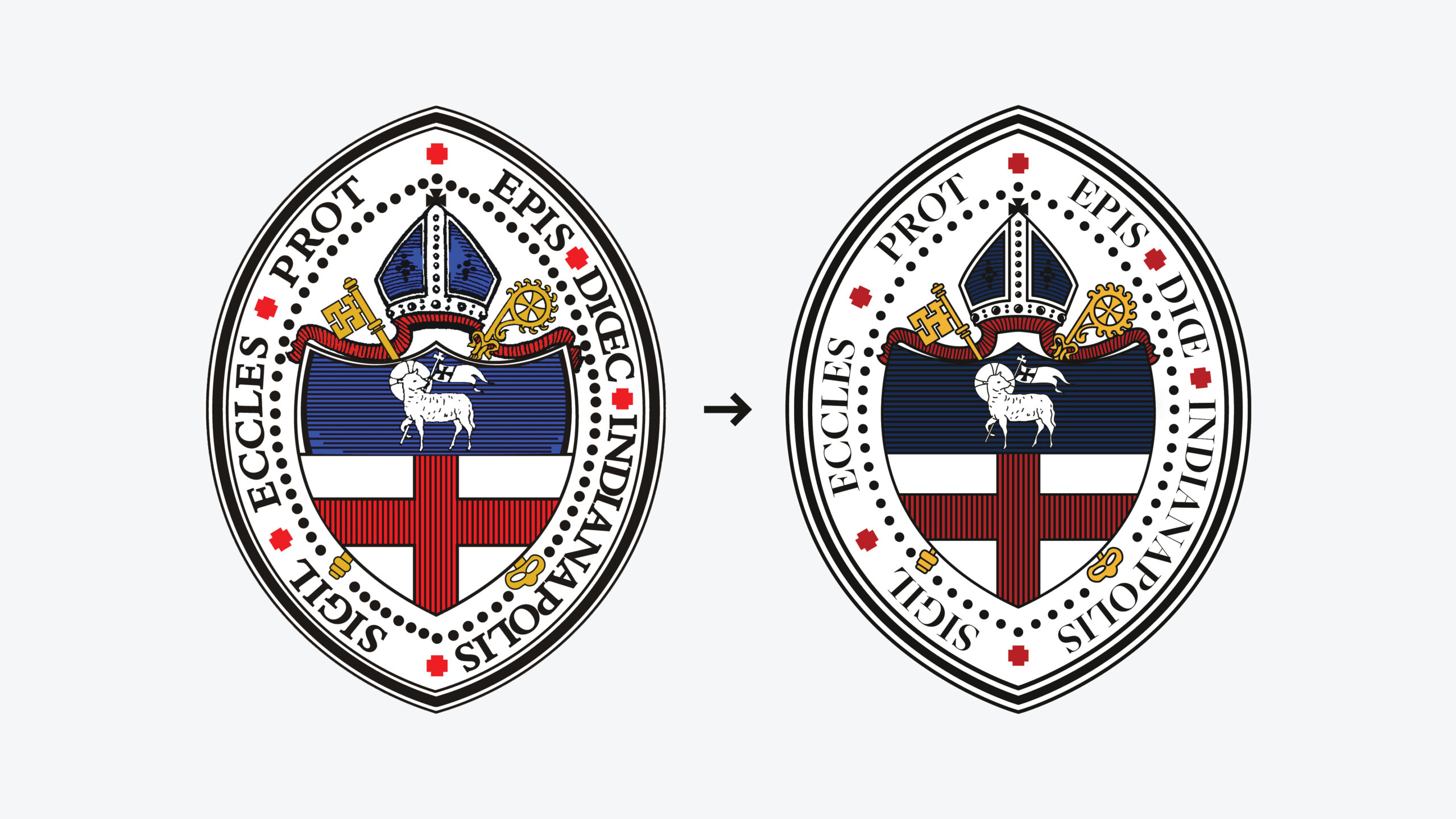
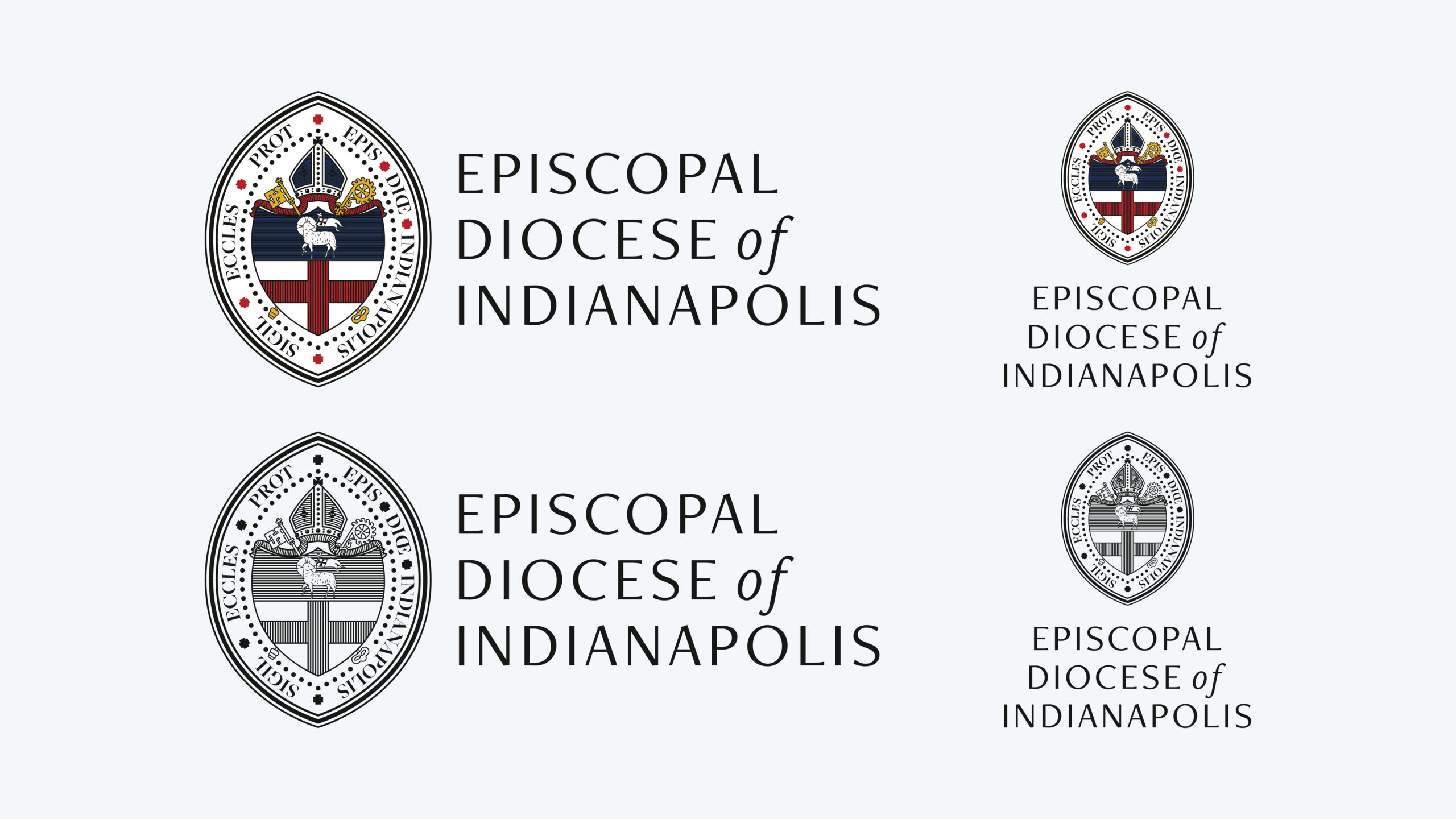
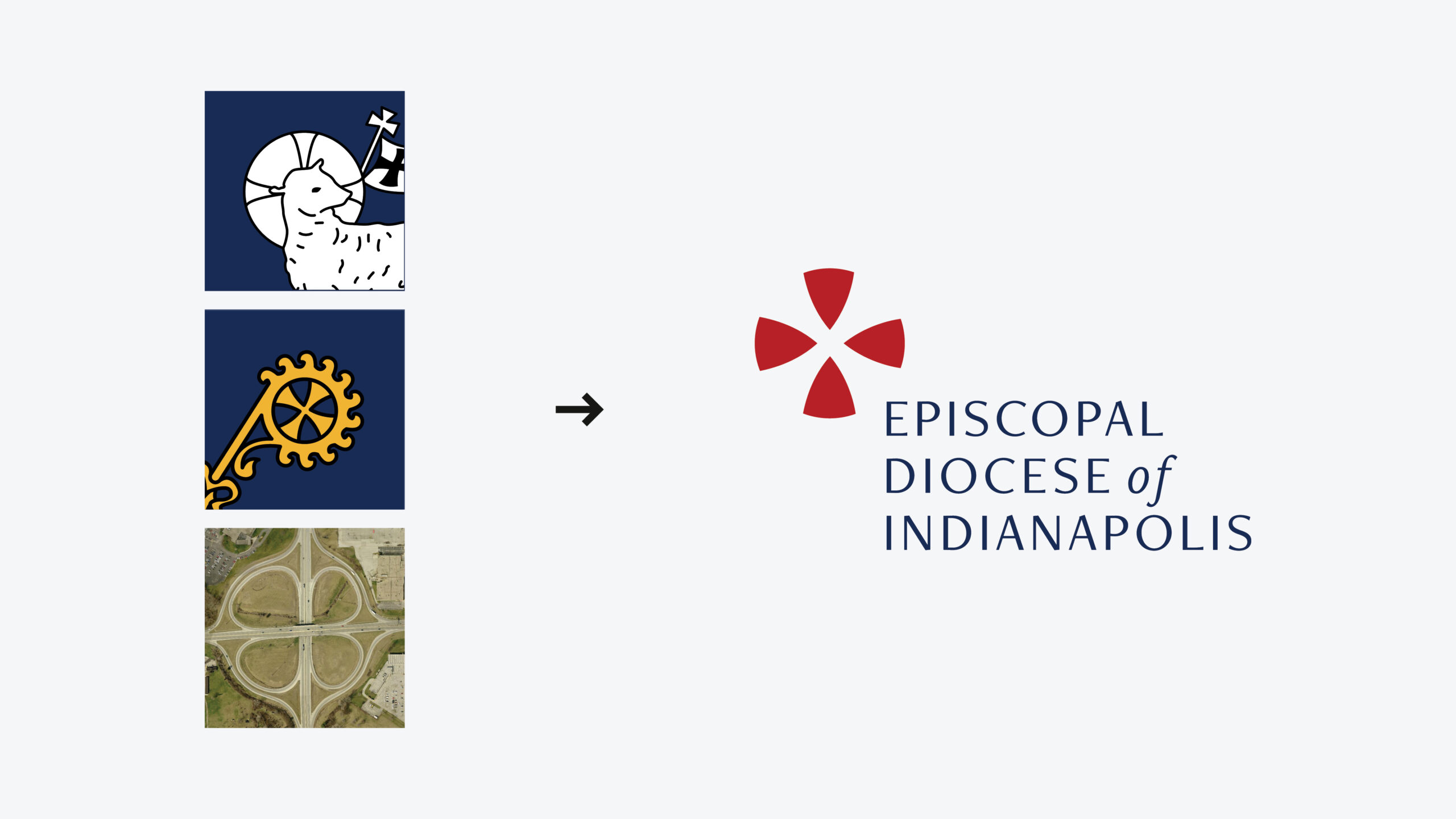
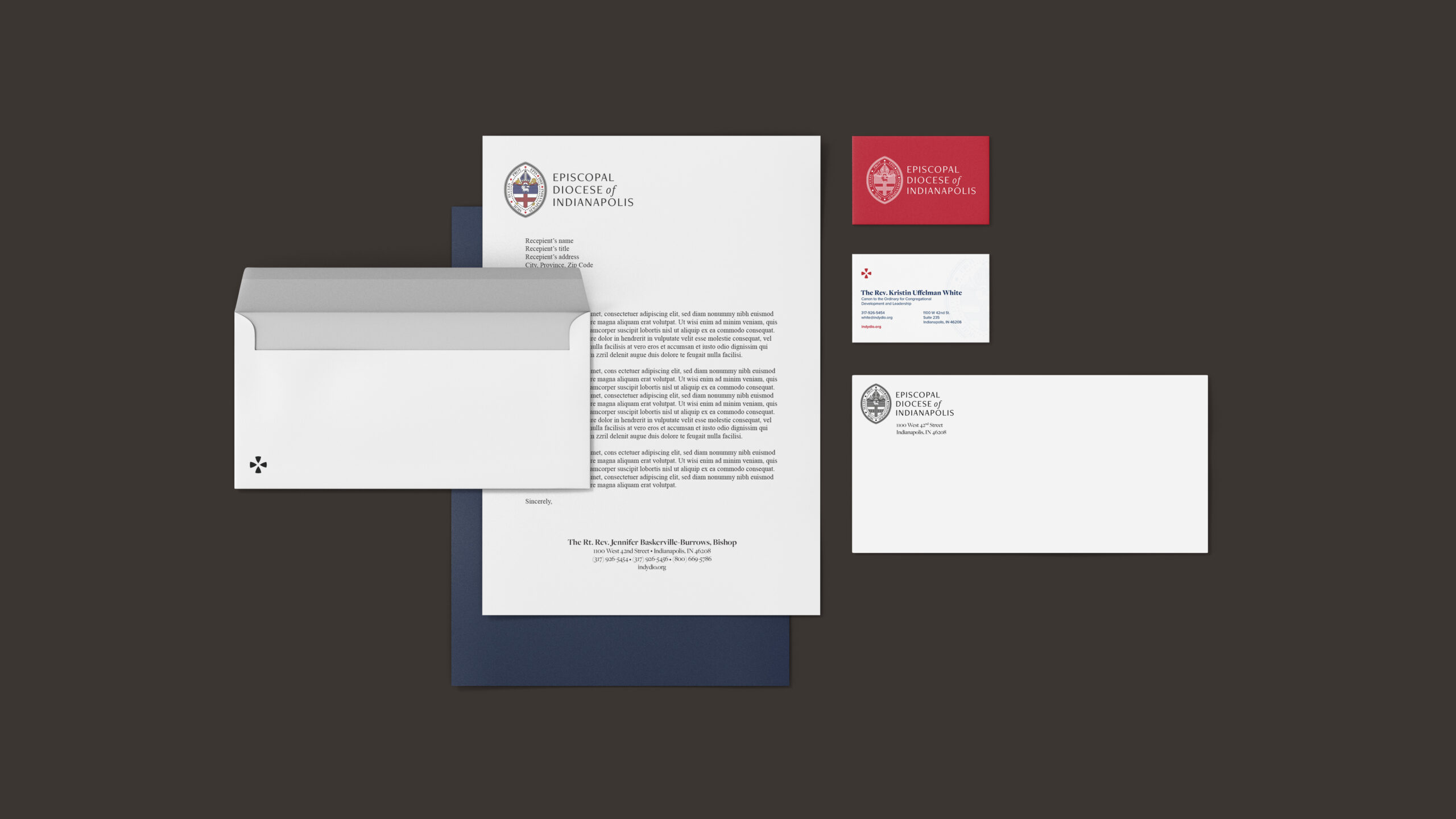
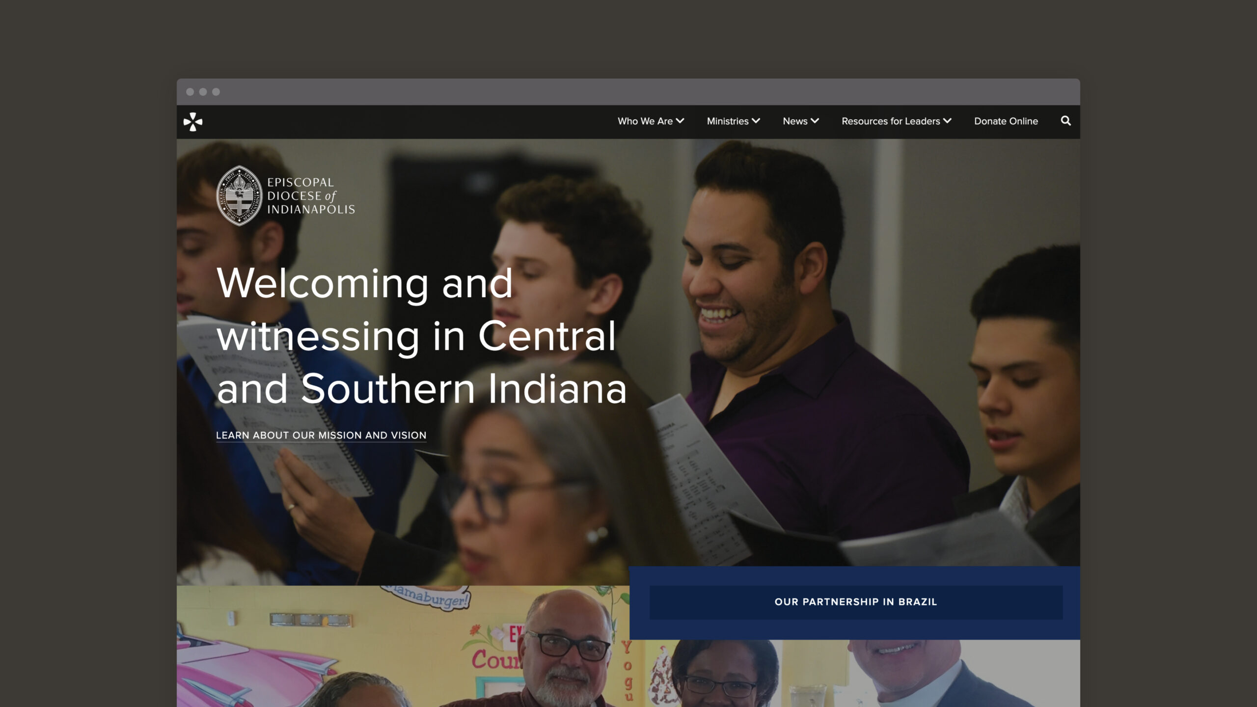
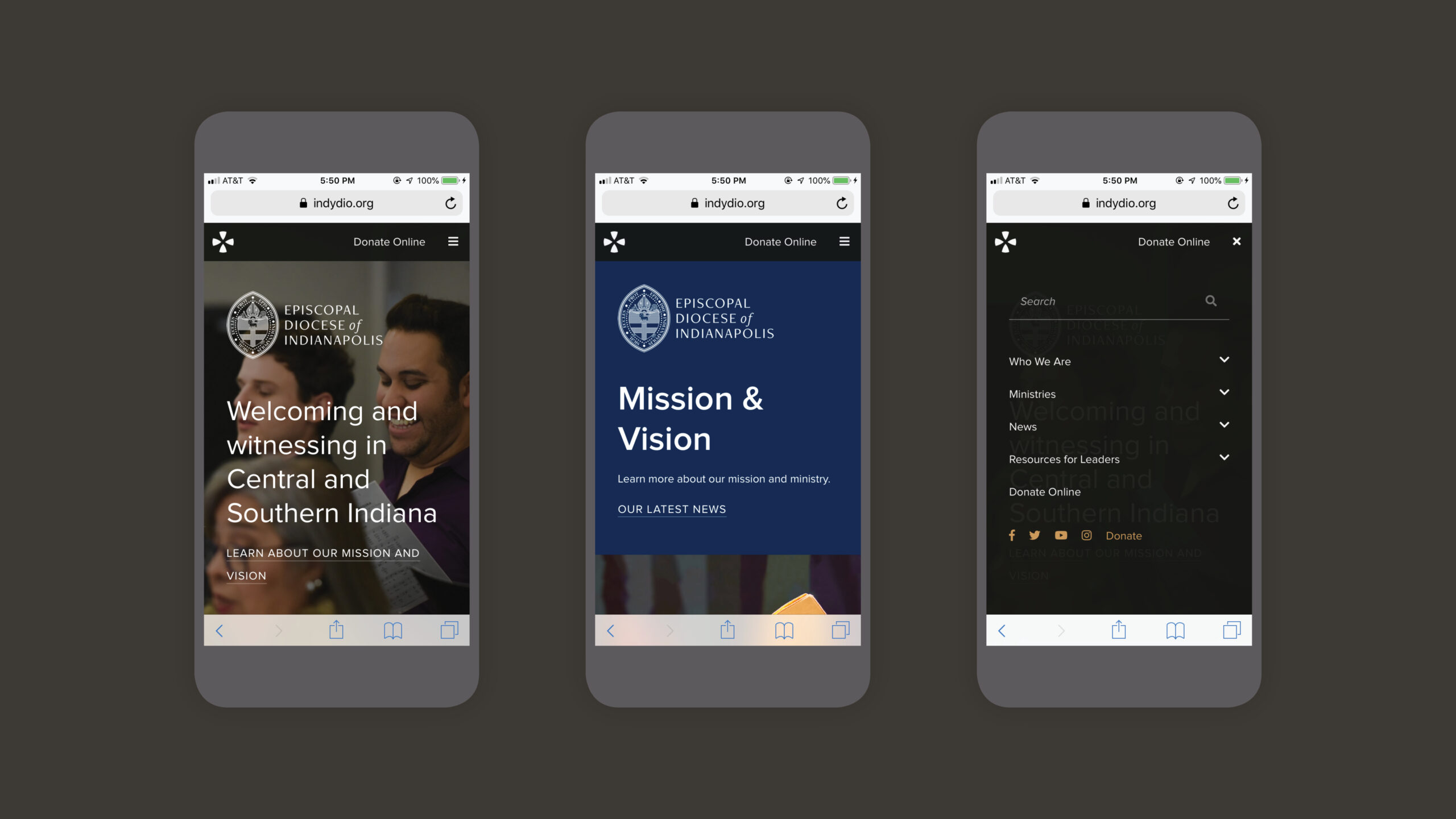
During 2018, I worked with the Episcopal Diocese of Indianapolis to update and extend their brand, including a redrawn shield, a new icon for legibility at small sizes, modernized color palette, and more consistent typography. The brand redesign was accompanied by a new website, but when the initial vendor provided a product the Diocese wasn't satisfied with, I helped to rework the site to fit their vision.


Made in → 2019
Created at → Canticle Communications

Shield redrawn, now in vector format; Simplified in places; Line widths more organized and consistent; Typeface updated to match new identity; Color palette updated to be more muted and modern.
Horizontal and vertical lockups with new typography
Adapted from the halo of the Lamb of God and the Bishop’s crozier that appear on the shield, as well as Indiana’s identity as the “Crossroads of America,” the icon uses the positive space to show a traditional cross, but uses the negative space to show the graphic motif used in the shield and gives the idea of an intersection or “crossroads.” The icon allows the diocese to maintain a cohesive identity while adding a more modern element to the system, ideal for the website, social media, and at small sizes.
Excerpts from the identity guidelines booklet created to maintain continuity throughout the brand.
Brand collateral including new stationery and business cards.
Accompanying the brand redesign was a new website built on Wordpress, utilizing the new shield and icon, as well as the updated colors and typography. See the full site at indydio.org.
The website is completely mobile-responsive, including a mobile-only menu that allows easy access to all pages on the site.